


Graphing Sea Ice Extent in the Arctic and Antarctic 
| Summary: |
Students graph sea ice extent (area) in both polar regions (Arctic and Antarctic) over a three-year period to learn about seasonal variations and over a 30-year period to learn about longer-term trends. | Materials:
Worksheets:
|
| Source: |
Windows to the Universe original activity by Randy Russell, using data from the National Snow and Ice Data Center (NSIDC). | |
| Grade level: |
grades 5-12 | |
| Time: |
about 30-45 minutes | |
|
Student Learning Outcomes:
|
|
|
| Lesson format: |
Graphing | |
| Standards Addressed: |
|
DIRECTIONS:
Preparation:
- Print out copies of the student instructions sheet.
- Print copies of the two graphing worksheets (monthly graphing worksheet and yearly graphing worksheet).
- Print copies of the data tables. Cut these sheets into three pieces, so you can hand out the data tables at appropriate times during the lessons without "giving away" what is coming next. One piece should have Data Table #1; a second piece should have Data Table #2; and a third piece should have Data Tables #3 and #4.
Options and Notes:
- There is a large amount of background material on the Windows to the Universe web site about topics related to this activity (sea ice, the Arctic Ocean, the Southern Ocean, Earth's polar regions, etc.). See the links at the end of this document for more details.
- We also have animated maps showing seasonal variations in sea ice extent in the Arctic and Antarctic, as well as an interactive map viewer that allows you to choose two maps at different times to compare side-by-side. Again, see the links at the end of this document.
- Here are a couple of options for this activity that will allow you to condense the time required for it or to extend it, as you wish:
- You can have students graph just one year of monthly data, instead of all three years (2005 through 2007).
- You can have students graph 1980 through 2010 at 5-year intervals, or have them also include the data for 1979 and 2006 through 2009.
- Mathematically advanced students can do a least-squares fit of the trend lines for the annual Arctic sea ice decreases, to predict when they might reach zero.
- You can have students go online and look up data for years or months that we haven't supplied, such as the most recent data from this year.
- More details are included in the "Background Information" section below.
During class - step-by-step procedures:
- Briefly explain to your students that the Arctic Ocean has a large sea ice pack, and that the size (extent) of the area covered by sea ice changes from season to season throughout each year. You may want to show the students a map of the Arctic to situate them.
- Tell your students that they will be doing a graphing activity in which they will first predict, and then use actual data to study, the variation in extent of sea ice near the poles over time.
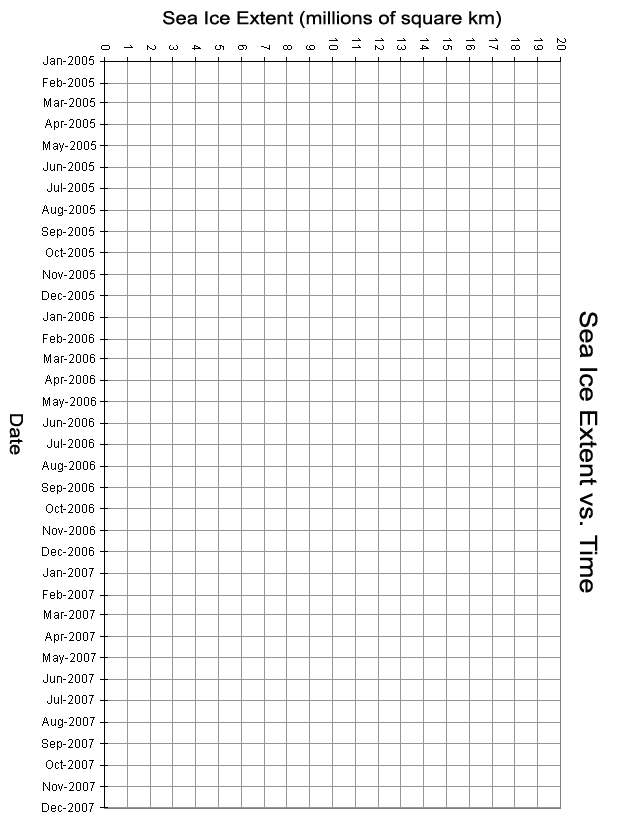
- Give your students Graph Sheet #1 (the x-axis on this sheet spans January 2005 through December 2007 on a month-by-month basis). Do NOT give your students any of the actual sea ice data yet.
- Ask your students to make a hypothesis about the extent of sea ice throughout the year. Have them predict which month will have the greatest amount of sea ice, and which month will have the least. Tell them that during the time period represented by their graphs (2005 through 2007) the maximum extent was about 15 million km2, and the minimum was about 4 million km2. Give your students Graphing Worksheet #1. Have the students predict the shape of the graph of sea ice extent over time by sketching in a curve on Graphing Worksheet #1 of how they think the sea ice extent varied during this three-year time period.
- Give your students Data Table #1, which lists sea ice extent in the Arctic on a monthly basis over a three-year period from January 2005 through December 2007. Ask your students to plot this data on Graphing Worksheet #1. Have them use a colored pencil of a different color than the one they used to sketch in their hypothesis.
- Have your students compare their hypotheses (the "prediction curves" they sketched in) with the plots of actual data. Discuss with your class any discrepancies between predictions and results based on data and the significance of those discrepancies.
- Next, have your students make a hypothesis about the variation, on a monthly basis over the same three-year period, of sea ice extent around Antarctica. As before, have them sketch in their "prediction curves" on the same graph, using a third colored pencil different from the first two. Tell them that the maximum extent of sea ice in the Antarctic during that time was about 19 million km2, and the minimum was about 3 million km2.
- Give your students Data Table #2, which lists sea ice extent in the Antarctic on a monthly basis over the same three-year period (from January 2005 through December 2007). Ask your students to plot this data on Graphing Worksheet #1. Have them use a (fourth) different colored pencil. Figure 1 shows a plot of the actual data from Data Tables #1 and #2.
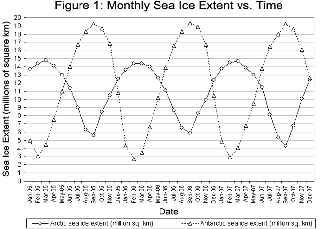
- Once again, have your students compare their hypotheses (the "prediction curves" they sketched in) with the plots of actual data for the Antarctic. Also, have them compare the curves for the Antarctic with those for the Arctic. Again, discuss any discrepancies between predictions and results, differences between the curves for the opposite hemispheres, and possible sources of those discrepancies and differences. It is likely that students may have some confusion regarding the causes of seasons and how the seasons differ between the Northern and Southern Hemispheres; you may want to review these concepts at this point in the lesson.
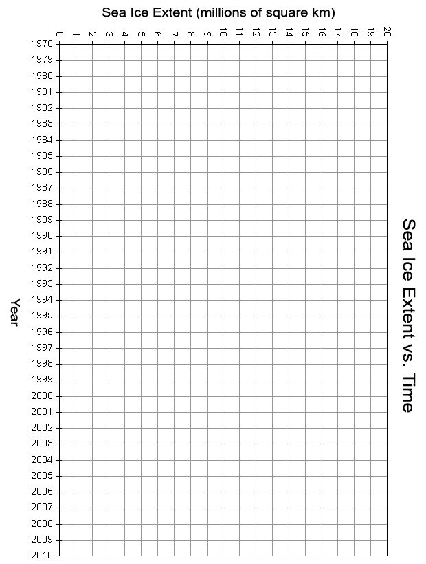
- Now that students have a sense of the seasonal variation in sea ice extent in each of the two hemispheres, let's have them look at longer-term trends in the data. Give your students Graphing Worksheet #2. The x-axis on this worksheet lists individual years from 1978 through 2010. Also give your students Data Tables #3 and #4. These tables show the sea ice extent in the Arctic and the Antarctic during the months when the ice extent is at its minimum (September in the Arctic, February in the Antarctic) and at its maximum (March in the Arctic, September in the Antarctic) for a number of different years. The tables provide data at 5-year intervals starting in 1980 (1980, 1985, 1990, ... , 2010). They also provide data for 1979 (the first year for which this data was available) and for 2006 through 2009 (some of the most recent years for which this data is available).
- Have your students plot the data from Data Tables #3 and #4 on Graphing Worksheet #2. Have them use different colored pencils for each of the four data sets (Arctic maximum, Arctic minimum, Antarctic maximum, and Antarctic minimum). Figure 2 shows a plot of these data. Note: Figure 2 includes data for 1979 and 2006 through 2009. You may choose to have students just plot data for 5-year intervals starting in 1980, or have them also include the 1979 and 2006-2009 data as well.
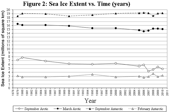
- Ask your students whether they see any long-term trends in these data. They should notice that there appears to be a gradual decline in sea ice extent (both at the minimum in September and at the maximum in March) in the Arctic. Scientists who have done a rigorous mathematical analysis of this trend report an average rate of decrease in extent of the Arctic sea ice pack in September from 1979 through 2010 of 11.5% (with an uncertainty of ± 2.9%) per decade. On the other hand, there is not an obvious trend, either an increase or a decrease, in the maximum or the minimum extent of Antarctic sea ice (within the levels of uncertainty or normal interannual variation).
- The models that climate scientists use to predict the effects of global climate change indicate that warming of Earth's climate will be most severe at high latitudes, and that the effects will be noticed earlier in the polar regions than at other places on our planet. Most climate scientists believe these effects are already being felt in the Arctic, and that changes in sea ice extent are one such noticeable effect. You may want to discuss these issues with your students at this point.
- Ask your students to predict, based on this data, in what year they think the Arctic would be ice-free in September if the current trend continues. Ask them how reliable they think their prediction might be. Note: A simple, linear extrapolation based on such a limited set of data probably is not especially reliable. You may want to discuss, at this point, various mathematical and scientific concepts, such as: functions/curves that are linear versus curves/trends that are not straight lines; uncertainty, error bars, and other intermittent fluctuations in data sets that make it difficult to make predictions based on small numbers of data points; the scientific phenomena that underlie these mathematical representations of sea ice extent, and how those phenomena are often complicated combinations that can have powerful feedbacks that produce non-linear effects (for example, less ice cover means that less incoming sunlight is reflected away, and thus more heat is absorbed, potentially speeding up the warming process in a positive feedback loop).
- If you want to, you can have students go to the web site of the National Snow and Ice Data Center (NSIDC) at http://nsidc.org/data/seaice_index/ and collect more data (for example, for years or months that our data sets do not include; or for the most recent months that are currently available) to plot and analyze.
ASSESSMENT:
- You can assess students' graphing skills and their initital hypotheses by examining their graphs.
- Class discussion of the students' expectations in their hypotheses as well as their explanations of discrepancies between their hypotheses and the actual data plots will help you assess their understanding of the science involved.
- Students' hypotheses about the monthly variation in Antarctic sea ice should help you note which of your students really understand how the seasons work.
BACKGROUND INFORMATION:
- When students first estimate the seasonal time variation (from 2005 through 2007) of the extent of sea ice in the Arctic (before they are given data), they should realize that the ice melts and shrinks in the summer and freezes and grows in the winter. Thus, their predicted minima should be somewhere around the summer, and their predicted maxima should be somewhere around the winter. In the Arctic, the yearly maximum generally occurs towards the end of winter or early spring, usually in March. The maximum is not in the middle of winter, when the temperatures are coldest. The ice pack continues to grow throughout the winter, thus reaching its maximum extent late in the winter season. Also, realize that water has a lot of thermal inertia; the Arctic Ocean does not cool down as quickly as does the air in the Arctic. Most students probably will not take these factors into account when they make their predictions, and may thus predict that the sea ice maximum occurs in December, January, or February. If some perceptive students do take this lag into account in their predictions, it would be good to call upon them to explain their predictions to the rest of the class. If none of your students take this lag into account when forming their hypotheses, make sure to point out the discrepancy between their predictions and the plot of actual data. Lead the students through a discussion of this lag and the causes of it. Likewise, their predictions for the time of minimum sea ice extent may be sometime in the middle of the summer, instead of the actual minimum which usually occurs in September. In a manner similar to the winter "lag", the summer temperatures, though highest in mid summer, remain above freezing throughout the summer and into early fall, so the sea ice continues to melt and its extent continues to shrink. Also, the Arctic Ocean, which warms throughout the summer, holds its heat longer than does the atmosphere into the cooling autumn.
- If you want to shorten the duration of this activity, you can have students plot just one or two years of data on a monthly basis, instead of having them plot the entire 36 months from January 2005 through December 2007. Or, you could divide the class into 2 or 3 groups. If you divide into three groups, have the first group plot the 2005 data, the second group 2006, and the third group 2007. If two groups, have one group plot 2005 and 2006, and the second group plot 2006 and 2007. Then combine the plots (cut and tape them together, or just view them side-by-side).
- We have provided yearly data for 1980 through 2010 at 5-year intervals, plus data for 1979 (the first year data was available) and for 2006 through 2009 (some of the most recent years' data at the time of this writing). We recommend just plotting 1980 through 2010, for simplicity's sake. However, we've included the 1979 and 2006-2009 data in case you want to use that as well. Note that the trends in the variation of both the minimum and maximum sea ice extent in the Arctic look quite a bit different depending on whether you include the 1979 and 2006-2009 data or not.
- When making predictions (hypotheses) about Antarctic sea ice extent on a monthly basis, many students may not take into account (or may not understand) the differences in seasons between the Northern and Southern Hemispheres. This can provide you with a very "teachable moment", and a great opportunity to discuss the cause of the seasons (the Earth's axial tilt, NOT variations in Earth's distance from the Sun; if the latter was the cause, both hemispheres should have the same seasons).
- There are substantial differences between the Arctic and Antarctic that influence the extent of sea ice packs in the two opposite polar regions. The central portion of the Arctic is all ocean, whereas Antarctica has a continent in the middle. The sea ice area in the Arctic includes the area closest to pole, while the sea ice area in the Antarctic is just the fringes around the edge of the continent and doesn't include the coldest region in the "center" nearest the South Pole. Also, the heat retention properties of a large land mass and huge ice sheet (in Antarctica) are very different that those of an large body of water (the Arctic Ocean). The net effects of these differences are not straightforward, but can be used as discussion points with your class.
- If you want to extend this activity, the web site of the National Snow and Ice Data Center (NSIDC) at http://nsidc.org/data/seaice_index/ has more data than that which we have presented here. You could have your students look up data for years or months that our data sets do not include, or for the most recent months that are currently available, to plot and analyze.
- You could have mathematically advanced students do a least-squares fit of a line to each (maximum and minimum) of the trends in the Arctic sea ice extent data to be more rigorous in their estimates of when the sea ice might be expected to disappear in the summer. You could have them do this for the 1980 through 2010 data, then with the 1979 and 2006-2009 data added in, to see how the inclusion of four more data points alters their fit line.
- Our web site, Windows to the Universe (www.windows2universe.org), has numerous resources you can use in support of this activity. They include animated maps of monthly sea ice extent for both hemispheres from 2002 through 2008; interactives that allow you to compare maps of sea ice extent in various years and months side-by-side; numerous background info pages on the polar regions, sea ice, and the Arctic and Southern Oceans; and several pages on global climate change. See the links at the bottom of this page for more.
RELATED SECTIONS OF THE WINDOWS TO THE UNIVERSE WEBSITE:
- Movie of Yearly Changes in Sea Ice in the Arctic
- Movie of Yearly Changes in Sea Ice around Antarctica
- Compare Images of Arctic Sea Ice Extent Side-by-side
- Compare Images of Antarctic Sea Ice Extent Side-by-side
- Sea Ice in the Arctic and Antarctic
- The Arctic Ocean
- The Southern Ocean
- Earth's Polar Regions
OTHER RESOURCES:
Last modified October 11, 2010 by Randy Russell.


