

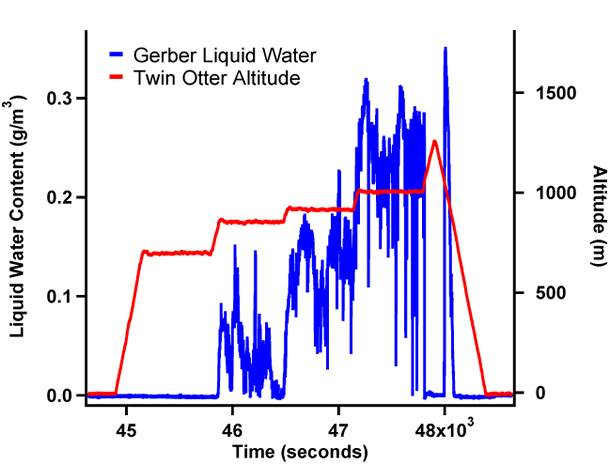
Image Courtesy of Dione Rossiter | ||||
| ||||
You might also be interested in:
Cool It! Game
Check out our online store - minerals, fossils, books, activities, jewelry, and household items!...more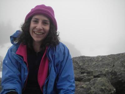
Rhea George
Many students in atmospheric science were motivated to enter the field by some fascinating extreme weather event experienced as a child. This was not the case with me. When I was an undergraduate I was...more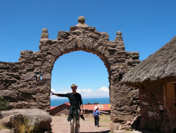
Dr. Boris Dewitte
I'm a physical oceanographer interested in climate variability and especially the El Niño phenomenon. Other than the annual cyle of the seasons, El Niño is the largest pulsation of the climate. I'm interested...more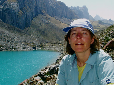
Dr. Paquita Zuidema
Hola! I am originally from the Netherlands and thereafter spent 3 years as a child in the Peruvian Andes, but I have lived most of my life in the United States. I received my bachelor's degree in physics...more
Lelia Hawkins
I am starting my fourth year of graduate school at Scripps Institution of Oceanography, studying atmospheric chemistry and climate science. I love earth science and have always wanted to do something...more
Dr. Jeff Snider
I am a university professor involved in studies of the concentration and type of particles contained within clouds. It is important to know these things in order to say how often clouds produce precipitation...more
Dr. Chris Zappa
I am a specialist in ocean-atmosphere interactions. My interests include wave dynamics and wave breaking, the effect of near-surface turbulence on heat, gas, and momentum transport, airborne infrared...more
Jake Crouch
I am a graduate student studying meteorology at North Carolina State University in Raleigh, NC. I grew up in Beckley, WV and obtained my B.S. in meteorology from the University of North Carolina Asheville....morePlease log in
Science Blogs
Real Climate: climate science from climate scientists

Windows to the Universe, a project of the National Earth Science Teachers Association, is sponsored in part is sponsored in part through grants from federal agencies (NASA and NOAA), and partnerships with affiliated organizations, including the American Geophysical Union, the Howard Hughes Medical Institute, the Earth System Information Partnership, the American Meteorological Society, the National Center for Science Education, and TERC. The American Geophysical Union and the American Geosciences Institute are Windows to the Universe Founding Partners. NESTA welcomes new Institutional Affiliates in support of our ongoing programs, as well as collaborations on new projects. Contact NESTA for more information.
